
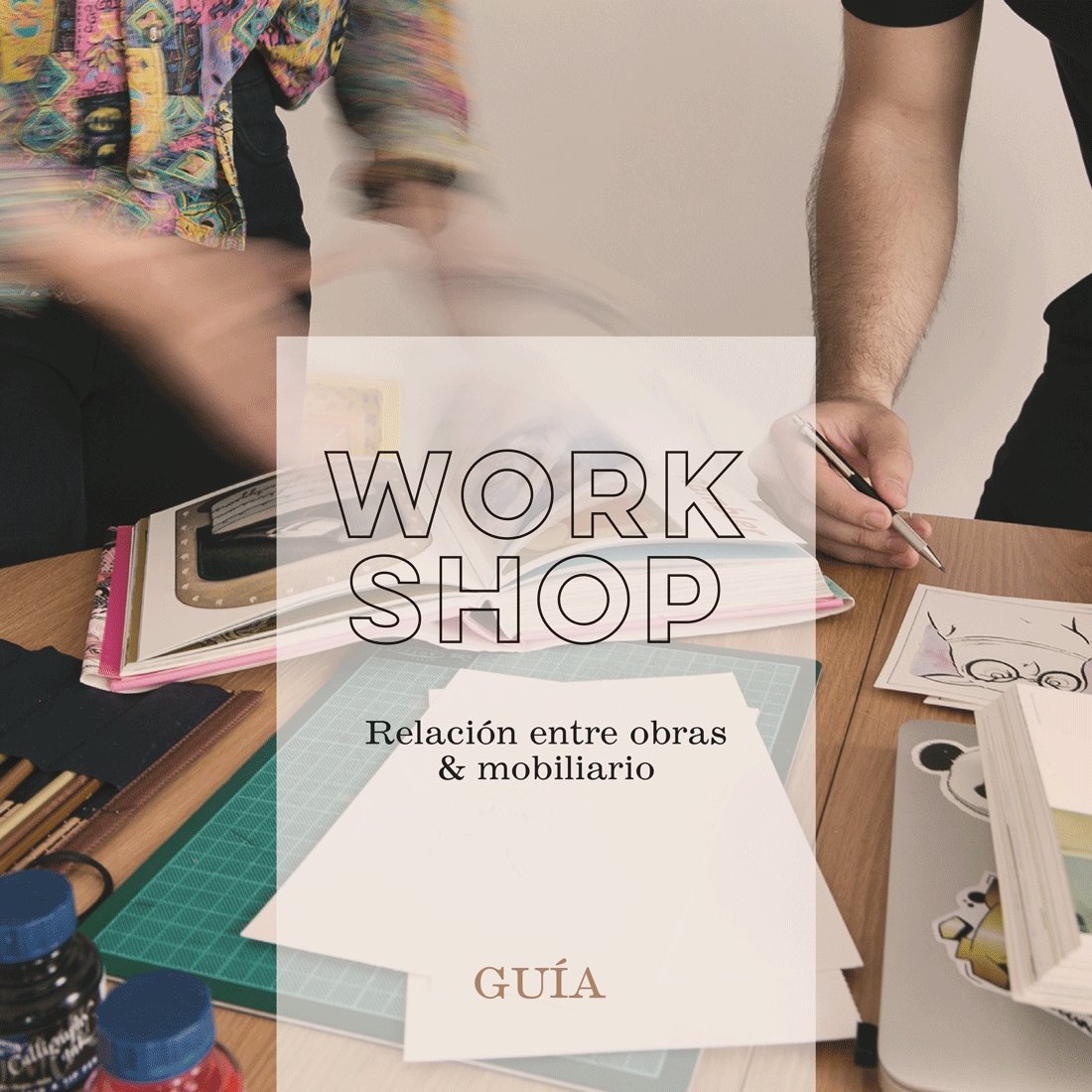
GUIDE: Relationship between artwork and furniture
Although it may seem obvious, many overlook important details when decorating a space and realize their mistakes once everything is set up, making changes becomes complicated. Therefore, it's better to do things correctly from the beginning.
Decorating your walls with posters adds color and personality to any space. However, creating your own gallery at home can be quite a challenge if you don't know where to start. An empty wall or a piece of art that doesn't fit in proportion can greatly affect the perception and appreciation of both the artwork and the space itself.
With these tips, you'll be able to create an attractive wall that will catch the attention of any visitor due to the harmony between the elements that make up the space.
An excellent way to start (aside from being motivated) is to select a Print that has colors or tones that complement the elements already present or chosen for the space we want to decorate. With this decision made, we are ready to move forward in this enjoyable creative process.
The key to effectively decorating a space is to relate the selected artworks to the furniture. This allows all the elements of the space to integrate into an attractive and eye-catching composition. Thus, the place becomes an inviting space to enjoy and contemplate the objects that make it up, creating a cozy atmosphere full of stories and emotions.

If the elements do not form a cohesive ensemble, it is likely because a very small piece is hung on a wall that is proportionally much larger, leaving a lot of blank space that makes it seem as if the objects are floating or hovering in the place without being part of a system. This would influence our perception of the environment, resulting in a place without connections, without life, without a story that narrates the relationship between all the objects that make up the space.
Proportions: Too Big
If the elements appear clustered and create a visually burdensome or unwanted weight, we are likely facing a similar problem to the previous one. This occurs when the piece is too large compared to the wall or space intended for it.
The lack of space between the objects in the composition can make the piece seem cramped, without room to breathe. In addition to suffocating the piece, the lack of adequate space prevents the elements of the space from being properly appreciated or contemplated in the best possible way.

Conclusion
In short, when decorating a space, it's important to consider two key points: the space available, the size of the objects, and the colors of the elements. An easy way to unify the look and feel of the place is to combine the colors of the elements that make up the space.
By following these tips, you can avoid the most common mistakes when decorating with prints and create a harmonious and appealing space.
Additional tips
If you're not sure how to position a print, you can use adhesive tape to try different placements before nailing it to the wall.
You can use frames of different colors and styles to add a personal touch to your posters.